Watch how AI learns to classify images
Looking under the hood of machine learning routines while they learn about things.
[Find the Jupyter Notebook to this article here.]
There exist already many tutorial and demos that show nicely how machine learning routines can learn from images and do wondrous tasks. And so, this article is not about what they can do, nor about the code to get there, but about what’s happening while the machines are learning.
I hope that the animations in this article can show in an intuitive way, how current machine learning routines start from randomness and learn very quickly how to extract meaningful features from data to solve a given task in a efficient and impressive way. So let’s jump right into it!
The data set
First things first, we need a data set and a problem. Mixing things up slightly, lets use the Fashion MNIST dataset and a classification task. In short, the Fashion MNIST contains 70’000 Zalando clothing items, where each item is a 28 x 28 pixel, gray-scaled image, belonging to 10 different clothing categories.
import numpy as np
import tensorflow as tf

# Load and prepare dataset
fashion_mnist = tf.keras.datasets.fashion_mnist
(X_tr, y_tr), (X_te, y_te) = fashion_mnist.load_data()
labels = [
    "T-shirt/top",
    "Trouser",
    "Pullover",
    "Dress",
    "Coat",
    "Sandal",
    "Shirt",
    "Sneaker",
    "Bag",
    "Ankle boot",
]
labels_tr = np.array([labels[j] for j in y_tr])
labels_te = np.array([labels[j] for j in y_te])
Before going any further, let’s take a quick look at a few of these images.
import matplotlib.pyplot as plt

# Plot a few random clothing items
size = 10
idx = np.random.choice(np.arange(len(y_tr)), size ** 2 * 2)
fig, axes = plt.subplots(size, size, figsize=(16, 16))
for i, ax in enumerate(axes.flatten()):
    ax.set_title(labels_tr[idx][i])
    ax.imshow(X_tr[idx][i], cmap="binary")
    ax.axis("off")
    ax.set_aspect("equal")
plt.tight_layout()
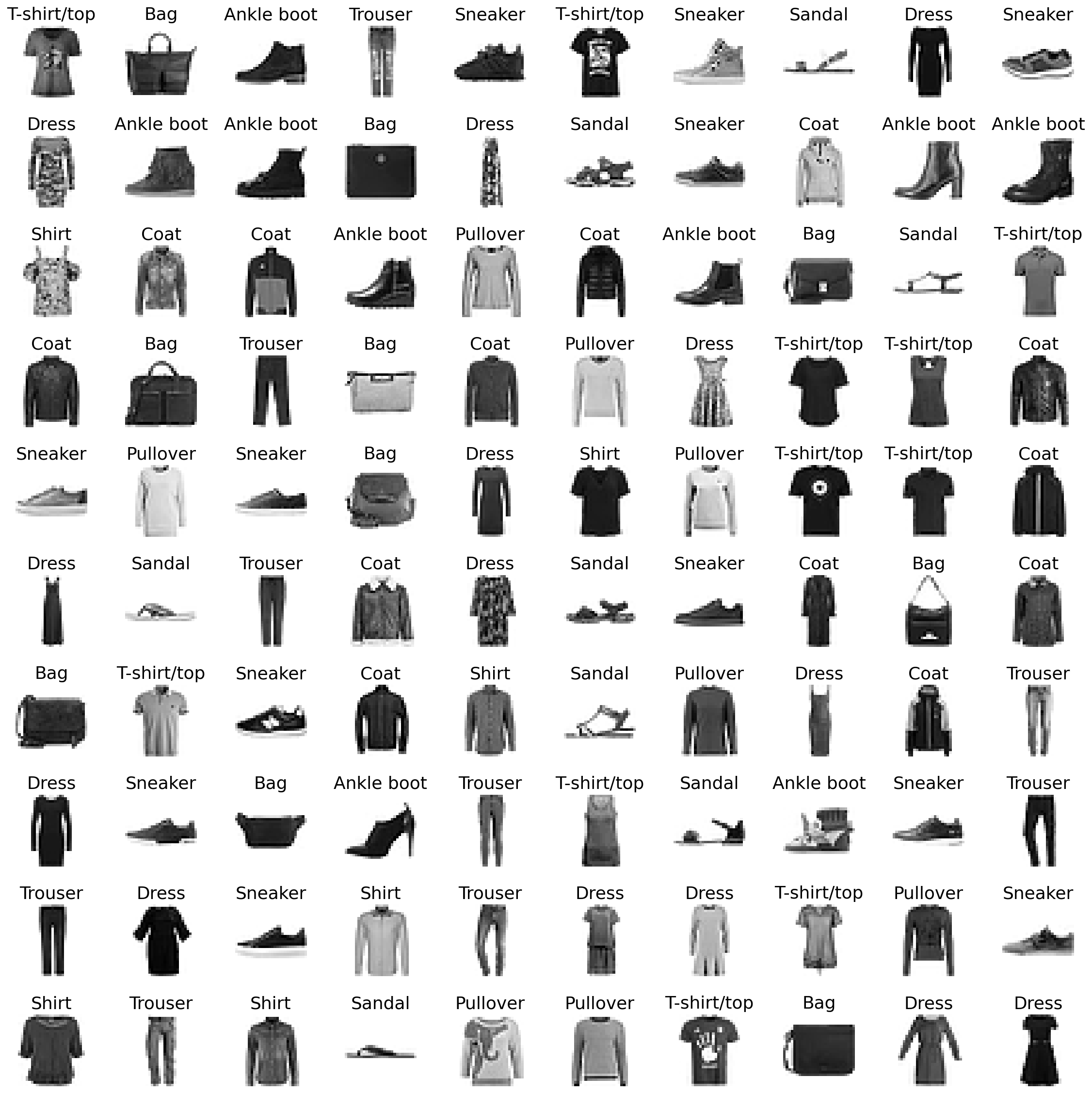
Looking at these images we can see that some categories look rather homogenious, while others are quite diverse. So let’s take a closer look at these target categories (i.e. classes) and how they might relate to each other.
A simple way to do this is by looking at the class averages and investigating how they correlate to each other.
# Look at class averages
class_averages = []
fig, axes = plt.subplots(1, 10, figsize=(16, 3))
for i, ax in enumerate(axes.flatten()):
    ax.set_title(labels[i])
    class_average = np.mean(X_tr[y_tr == i], axis=0) / 255
    class_averages.append(class_average)
    ax.imshow(class_average, cmap="binary")
    ax.axis("off")
    ax.set_aspect("equal")
plt.show()
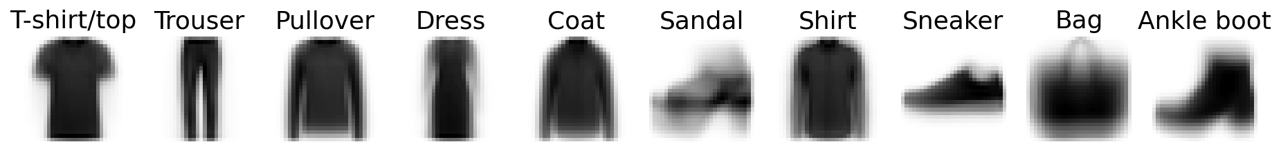
As we assumed, categories like Trouser, Pullover and T-shirt/top are rather heterogenous (i.e. sharp), while Dress, Sandal and Bag are a bit vague.
And how do these classes relate to each other? For this we will just simply investigate how correlated each of these class averages are, and then order this correlation matrix, by using seaborn’s hierarchically-clustered heatmap sns.clustermap().
import pandas as pd
import seaborn as sns

# Correlate class averages and plot hierarchically-clustered heatmap
corr = np.corrcoef(np.reshape(class_averages, (10, -1)))
df_corr = pd.DataFrame(corr, index=labels, columns=labels)
cm = sns.clustermap(
    100 * df_corr,
    cmap="coolwarm",
    annot=True,
    cbar=False,
    fmt=".0f",
    figsize=(10, 10),
)
cm.ax_row_dendrogram.set_visible(False)
cm.ax_col_dendrogram.set_visible(False)
cm.cax.set_visible(False)
plt.show()
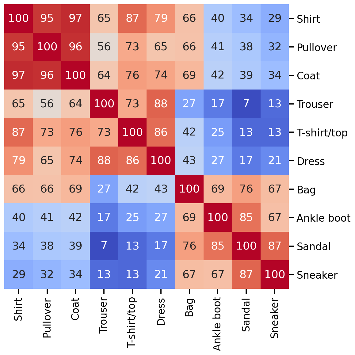
Great, there seems to be some structure. Given this correlation matrix, we could assume that a machine learning model will have more problem to differentiate Shirt, Pullover and Coat from one another than from other classes. Similar thing for Sandal and Sneakers, etc.
Unsupervised Learning
Now that we know our data set a bit better and have an intuition for when our machine learning models might struggle, we can go ahead and train them. First, let’s start with an unsupervised learning approach, specifically with UMAP, i.e. Uniform Manifold Approximation and Projection for Dimension Reduction.
The details about how UMAP works are not important here, but what you should know is the following: This unsupervised learning method tries to find a lower-dimensional manifold on which our high-dimensional data set lies. Once this manifold is known (or estimated), we can try to unfold and flatten it onto a 2-dimensional plane and visualize it in a human-understandable form. In contrast to other similar approaches (e.g. t-SNE), UMAP allows the reduction to more than just two dimensions and also contains a .transfrom() function, meaning that the mapping can even be reversed for new samples in the dataset.
import umap

# Get samples into a 1D shape
data = X_tr.reshape(-1, 28 ** 2) / 255.0

# Train UMAP model
transformer = umap.UMAP(
    n_neighbors=15,
    random_state=24,
    learning_rate=0.33,  # Lower than usual to slow down model improvement for visualization
    min_dist=0.2,  # Chosen to lead to a nice final spread of point cloud
    n_epochs=128,
    n_jobs=1,  # Keeping it sequential to extract epochs one after the other
)
embedding = transformer.fit_transform(data)
As many such machine learning models, the model is initiated with more or less random parameters and then slowly optimizes to an impressive end result. To fully appreciate how well this works, it is important to understand that this routine doesn’t know about the target classes, and as such only works with similarities in the high-dimensional space.
import matplotlib.patheffects as PathEffects


def plot_umap(embedding, y_tr, labels, step):

    fig, ax = plt.subplots(1, figsize=(11, 10))
    ax = plt.subplot(aspect="equal")

    plt.scatter(*embedding.T, s=0.4, c=y_tr, cmap="Spectral", alpha=1.0)
    if step == 1:
        title_txt = "Original data"
    elif step == 121:
        title_txt = "Transformed Data"
    else:
        title_txt = "Iteration Step: %03d" % step
    plt.title(title_txt, fontsize=28)

    cbar = plt.colorbar(boundaries=np.arange(11) - 0.5)
    cbar.set_ticks(np.arange(10))
    cbar.set_ticklabels(labels)

    plt.xlim(-5, 17)
    plt.ylim(-7, 16)
    ax.axis("off")

    # We add the labels for each class
    for i, t in enumerate(labels):
        # Position of each label
        xtext, ytext = np.median(embedding[y_tr == i, :], axis=0)
        txt = ax.text(xtext, ytext, str(t), fontsize=24)
        txt.set_path_effects(
            [PathEffects.Stroke(linewidth=5, foreground="w"), PathEffects.Normal()]
        )
    plt.tight_layout()

    return fig

# Optimize UMAP 128 times and store each step in an image
for n in range(128):
    fig = plot_umap(np.load("emb_%04d.npz" % n)["embedding"], y_tr, labels, n)
    fig.savefig("fig_%04d.jpeg" % n)
    fig.clf()

# Remove first figure as it is confusing
!rm fig_0000.jpeg

# Duplicate first and last figure to have a "resting phase" impression
!for i in {1..12}; do cp fig_0001.jpeg fig_0001_$i.jpeg; done
!for i in {1..12}; do cp fig_0127.jpeg fig_0127_$i.jpeg; done

# Transform jpgs into video
!ffmpeg -y -framerate 12 -pattern_type glob -i 'fig*.jpeg' umap_animation.gif

# Remove temporary files
!rm fig_*.jpeg emb_*.npz

# Visualize gif
from IPython.display import Image
Image(url="umap_animation.gif")
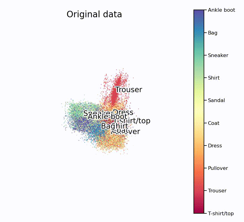
Nice, isn’t it? What is especially nice to see is that the UMAP projection supports our assumption from the hierarchically-clustered heatmap from before. Or in other words, target classes that are highly correlated with each other also seem to overlap on the lower-dimensional manifold.
head_embedding to a new file (e.g. np.savez(filename, embedding=head_embedding).
Supervised Learning
Let’s now explore what we can do if we chose a supervised learning approach and provide the machine learning model with the target class labels. While this would also be possible with a UMAP approach, let’s switch gears a bit and use a convolutional neural network, or short CNN, instead. A CNN is a particular kind of neural network that is specialized for analyzing data with spatial structure (e.g. images or time-series data).
In short, what a CNN tries to do is the following: Find meaningful patterns in an image that help to differentiate target classes. For example, does one class of images have more straight lines than others, or more “wavy bits”? Do some images have more dots or wrinkles, do they have handles or shoe laces, etc. The CNN tries to find specific image patterns that are unique to some classes. Once it knows what kind of patterns can be found, it can use this information to predict if an image looks more than one class or another.
Another data set
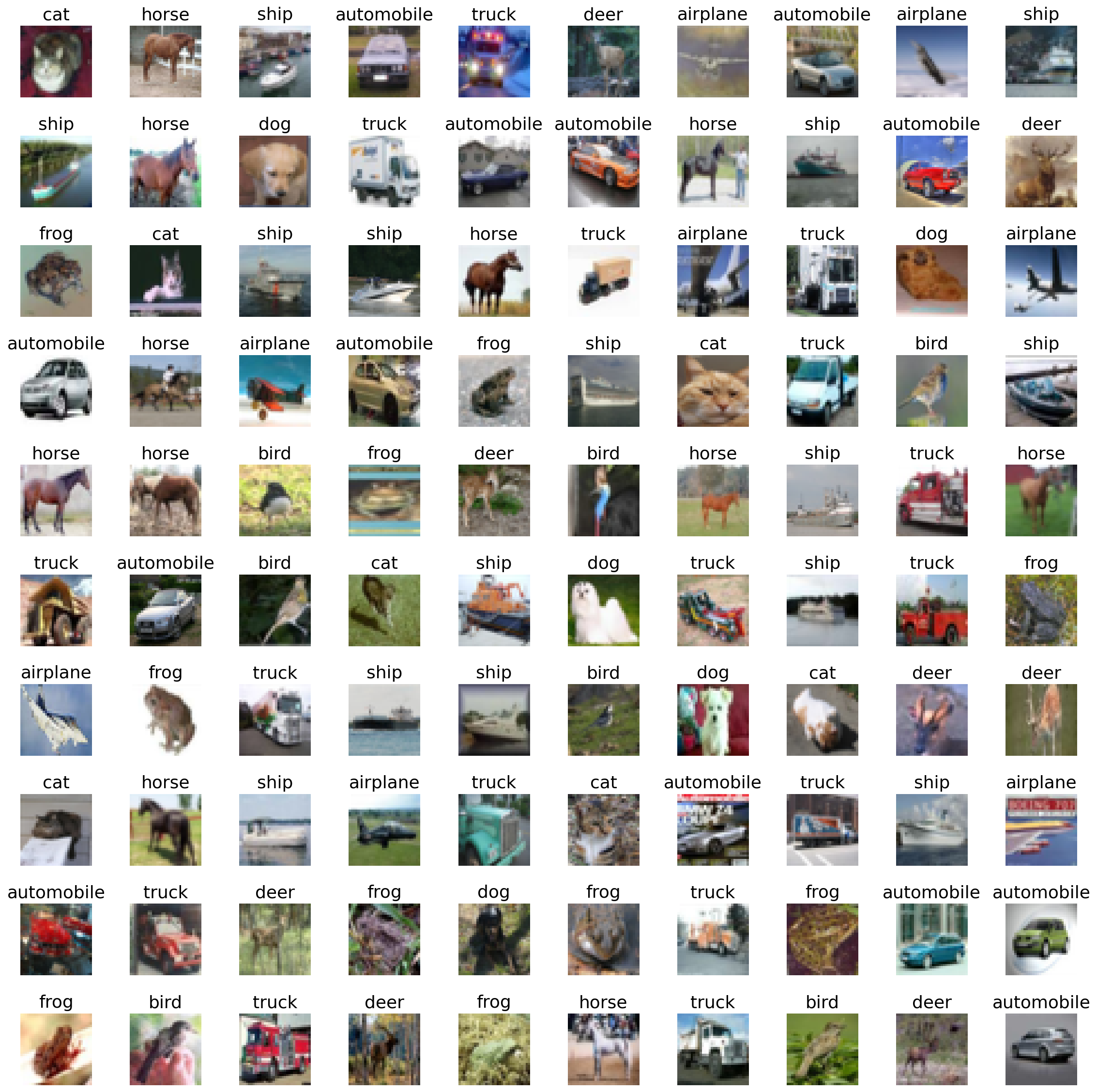
To better illustrate the wonder of such CNNs, let’s also go to a bit more naturalistic dataset: The CIFAR-10. Similar to the Fashion-MNIST dataset, this data set contains 70’000 color images, with a pixel resolution of 32 x 32, of 10 different target classes: airplane, automobile, bird, cat, deer, dog, frog, horse, ship and truck. Let’s have a quick look at this dataset:
import numpy as np
import tensorflow as tf

# Load and prepare dataset
(X_tr, y_tr), (X_te, y_te) = tf.keras.datasets.cifar10.load_data()
y_tr = y_tr.ravel()
y_te = y_te.ravel()

labels = [
    "airplane",
    "automobile",
    "bird",
    "cat",
    "deer",
    "dog",
    "frog",
    "horse",
    "ship",
    "truck",
]
labels_tr = np.array([labels[j] for j in y_tr])
labels_te = np.array([labels[j] for j in y_te])

# Prepare dataset for CNN
x_train = X_tr.astype("float32") / 127.5 - 1
x_test = X_te.astype("float32") / 127.5 - 1

from sklearn.model_selection import train_test_split

# Split train and validation set
x_train, x_valid, y_tr, y_va = train_test_split(
    x_train, y_tr, test_size=2000, stratify=y_tr, random_state=0,)

import matplotlib.pyplot as plt

# Plot a few random clothing items
size = 10
idx = np.random.choice(np.arange(len(y_tr)), size ** 2 * 2)
fig, axes = plt.subplots(size, size, figsize=(16, 16))
for i, ax in enumerate(axes.flatten()):
    ax.set_title(labels_tr[idx][i])
    ax.imshow(X_tr[idx][i], cmap="binary")
    ax.axis("off")
    ax.set_aspect("equal")
plt.tight_layout()
Model creation
Next, let’s create a simple convolutional neural network, using TensorFlow:
import tensorflow as tf
from tensorflow import keras
from tensorflow.keras import layers

# Create Conv Net
inputs = tf.keras.Input(shape=(32, 32, 3))

# Entry block
x = layers.Conv2D(64, kernel_size=(5, 5), padding="same",
    kernel_initializer=tf.keras.initializers.TruncatedNormal(stddev=0.01))(inputs)
x = layers.Activation("relu")(x)
x = layers.MaxPooling2D(2, strides=2)(x)

x = layers.Conv2D(64, kernel_size=(3, 3), padding="same", activation="relu",
    kernel_initializer=tf.keras.initializers.TruncatedNormal(stddev=0.01))(x)
x = layers.MaxPooling2D(2, strides=2)(x)

x = layers.Flatten()(x)
x = layers.Dropout(0.25)(x)
x = layers.Dense(256, activation="relu",
    kernel_initializer=tf.keras.initializers.VarianceScaling(scale=2))(x)
x = layers.BatchNormalization()(x)

outputs = layers.Dense(10, activation="softmax")(x)

model = tf.keras.Model(inputs, outputs)

model.compile(
    optimizer=tf.keras.optimizers.Adam(learning_rate=0.0005),
    loss="sparse_categorical_crossentropy",
    metrics=["accuracy"])

model.summary()
Model: "model_1"
_________________________________________________________________
 Layer (type)                Output Shape              Param #
=================================================================
 input_1  (InputLayer)          [(None, 32, 32, 3)]    0
 conv2d_2  (Conv2D)              (None, 32, 32, 64)    4864
 activation_3 (Activation)       (None, 32, 32, 64)    0
 max_pooling2d_4 (MaxPooling2D)  (None, 16, 16, 64)    0
 conv2d_5 (Conv2D)               (None, 16, 16, 64)    36928
 max_pooling2d_6 (MaxPooling2D)  (None, 8, 8, 64)      0
 flatten_7 (Flatten)             (None, 4096)          0
 dropout_8 (Dropout)             (None, 4096)          0
 dense_9 (Dense)                 (None, 256)           1048832
 batch_normalization_10 (Batch   (None, 256)           1024
 Normalization)
 dense_11 (Dense)                (None, 10)            2570
=================================================================
Total params: 1,094,218
Trainable params: 1,093,706
Non-trainable params: 512
_________________________________________________________________
This is certainly not the most efficient, nor the best performing network, but it allows us to observe the inner workings of a neural network. But before we go ahead and train the network, let’s take a look at the ‘raw’ and untrained version of it.
def plot_first_layer_kernels(kernels, title=None):

    # Create a grid of subplots
    fig, axes = plt.subplots(nrows=8, ncols=8, figsize=(4, 4))

    # Remove gaps between suplots
    plt.subplots_adjust(wspace=0, hspace=0)

    # Plot the 64 kernels from the first convolutional layer
    for j, axis in enumerate(axes.flatten()):
        # Get i-th kernel (shape: 5x5x3)
        kernel = kernels[:, :, :, j]

        # Rescale values between 0 and 1
        kernel -= kernel.min()  # Rescale between 0 and max
        kernel /= kernel.max()  # Rescale between 0 and 1

        # Plot kernel with imshow()
        axis.imshow(kernel)
        axis.get_xaxis().set_visible(False)  # disable x-axis
        axis.get_yaxis().set_visible(False)  # disable y-axis
    plt.suptitle(title)
    plt.close()
    return fig

plot_first_layer_kernels(model.get_weights()[0])
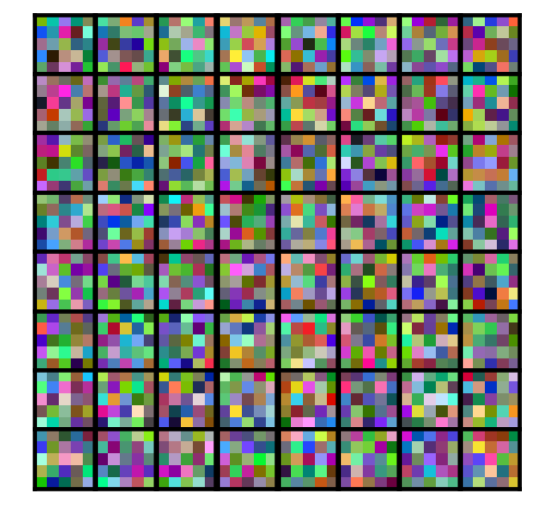
This is a picture of the first 16 convolutional kernels (or filters). In other words, what the CNN sees (or looks for) in the very first input layer.
Right now, all of the convolutional neural network’s parameter are randomly set. In other words, the ConvNet doesn’t know what to look for, its ‘eyes’ are still untrained. And so, if we give this untrained neural network an image to classify, it performs very poorly, and doesn’t really know which of the 10 classes to pick from.
def predict_single_image(model, x_test, y_te, labels, idx=0):
# Compute predictions
y_pred = model.predict(x_test)
# Prepare image
img = np.squeeze(x_test[idx])
img -= img.min()
img /= img.max()
# Get class probabilities
probability = y_pred[idx] * 100
# Get class names
class_names = labels
# Get predicted and true label of image
predicted_idx = np.argmax(probability)
predicted_prob = probability[predicted_idx]
predicted_label = class_names[predicted_idx]
import matplotlib.gridspec as gridspec
# Plot overview figure
fig = plt.figure(figsize=(13, 6))
gs = gridspec.GridSpec(1, 2, width_ratios=[1, 1])
# Plot image
ax = plt.subplot(gs[0])
plt.title("Image")
plt.imshow(img, cmap="binary")
plt.grid(False)
plt.xticks([])
plt.yticks([])
# Add information text to image
info_txt = "\nThis is to {:.02f}% a {}!".format(predicted_prob, predicted_label)
plt.xlabel(info_txt, fontdict={"size": 21})
# Plot prediction probabilities
ax = plt.subplot(gs[1])
plt.title("Prediction Probability")
y_pos = np.arange(len(probability))
plt.barh(y_pos, probability, color="#BFBFBF")
# Set y-label text
y_label_text = [
"{}: {:5.2f}%".format(e, probability[i]) for i, e in enumerate(class_names)
]
ax.set_yticks(y_pos)
ax.set_yticklabels(y_label_text)
ylim = list(plt.ylim())
plt.vlines(1 / len(probability) * 100, *ylim, linestyles=":", linewidth=2)
plt.ylim(ylim)
plt.tight_layout()
plt.show()
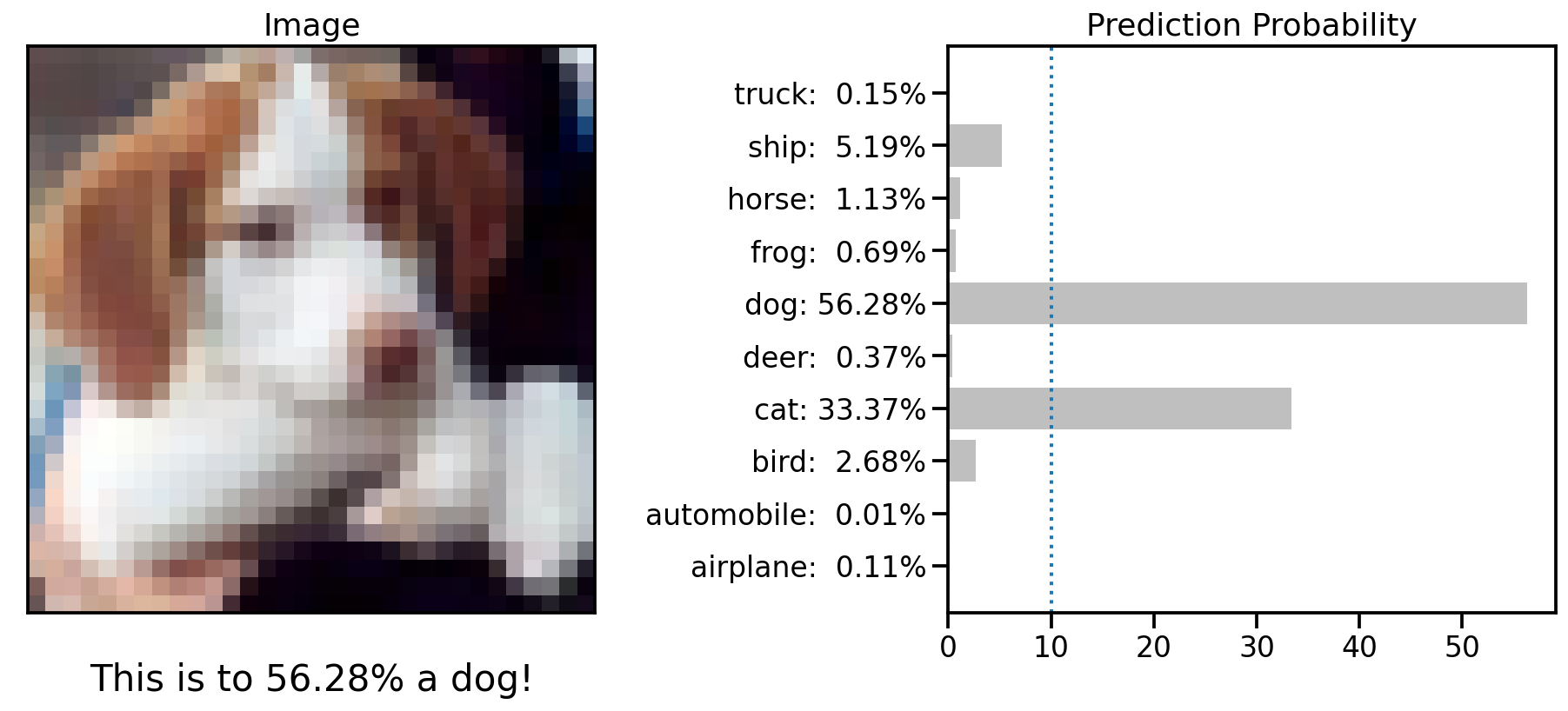
predict_single_image(model, x_test, y_te, labels, idx=16)
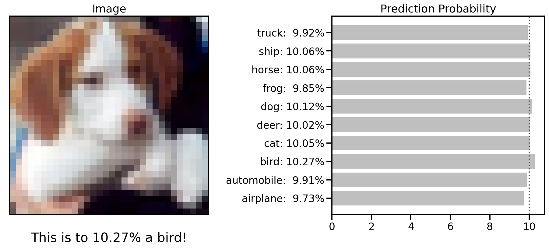
The illustration above shows with which class probability this untrained CNN would predict the dog shown in the image.
import matplotlib.gridspec as gridspec
def predict_multiple_images(
model, x_test, y_te, labels, nimg=5, seed=0, title_idx=None
):
# Set random seed
np.random.seed(seed)
# Compute predictions
y_pred = model.predict(x_test)
from sklearn.utils import shuffle
imgs = np.squeeze(x_test)
img_ids = shuffle(np.arange(len(x_test)))
# Plot first N image prediction information
fig = plt.figure(figsize=(nimg * 3, 6))
gs = gridspec.GridSpec(2, nimg, height_ratios=[1, 4])
for i_pos, idx in enumerate(img_ids[:nimg]):
# Get image
img = imgs[idx]
# Get probability
probability = y_pred[idx]
# Get predicted and true label of image
predicted_label = np.argmax(probability)
true_label = y_te[idx]
# Get class names
class_names = labels
# Identify the text color
if predicted_label == true_label:
color = "#004CFF"
info_txt = "{} {:2.1f}%\nCorrect!".format(
class_names[predicted_label], 100 * np.max(probability)
)
else:
color = "#F50000"
info_txt = "{} {:2.1f}%\nActually: {}".format(
class_names[predicted_label],
100 * np.max(probability),
class_names[true_label],
)
# Plot prediction probabilities
ax = plt.subplot(gs[0, i_pos])
pred_plot = plt.bar(range(len(probability)), probability, color="#BFBFBF")
pred_plot[predicted_label].set_color("#FF4747")
pred_plot[true_label].set_color("#477EFF")
xlim = list(plt.xlim())
plt.hlines(1 / len(probability), *xlim, linestyles=":", linewidth=2)
plt.xlim(xlim)
plt.ylim((0, 1))
plt.xticks([])
plt.yticks([])
plt.title("Class Probability")
# Plot image
ax = plt.subplot(gs[1, i_pos])
img -= img.min()
img /= img.max()
plt.imshow(img, cmap="binary")
plt.grid(False)
plt.xticks([])
plt.yticks([])
# Add information text to image
plt.xlabel(info_txt, color=color)
plt.suptitle(f"Epoch: {title_idx+1}")
plt.tight_layout()
fig.savefig("pred_%03d_%04d.jpg" % (seed, title_idx + 1))
fig.clf()
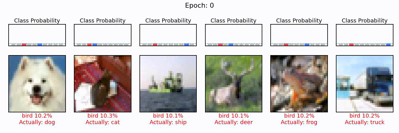
predict_multiple_images(model, x_test, y_te, labels, nimg=6, seed=0, title_idx=-1)
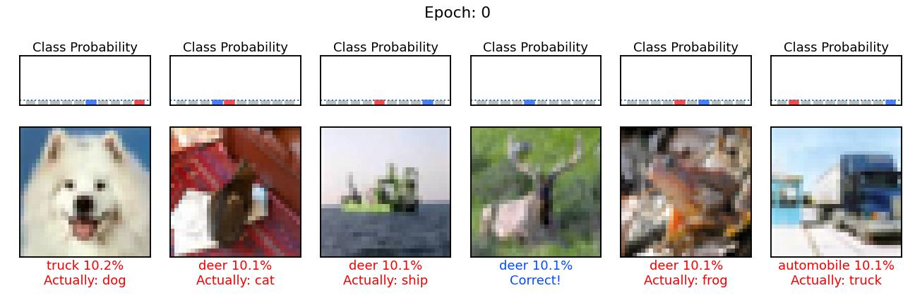
This is the same plot as with the dog above, but this time for six different images. The blue bar shows the probability of the class it should have predicted and the red one, the class probability of the wrongly predicted class. For now, all of these probabilities are at 10%, i.e. chance level.
Model training
Let’s now go ahead and train this model. There’s an endless depth to explaining how this actually works, but in simple terms, the model looks at a few images (i.e., a batch), tries to predict the target classes of these images, looks at how wrong it was and corrects its internal parameters accordingly.
# Create some helper lists for results storage
scores = []
kernels = []
activations = []

# Specify how many epochs to train for
N = 48

for i in range(N):
    history = model.fit(
        x_train,
        y_tr,
        batch_size=((i // 6) + 1) * 10,
        shuffle=True,
        epochs=1,
        validation_data=(x_valid, y_va),
        steps_per_epoch=(i * 2 + 1) * 5,
    )

    # Store kernels in array
    kernels.append(model.get_weights()[0])

    # Store activation maps in array
    img = x_test[16]
    model_conv = tf.keras.Model(model.input, model.layers[1].output)
    activations.append(model_conv.predict(img[None, ...]))

    # Stores scores in array
    scores.append(history.history)

    # Save predictions to image
    for sidx in range(12):
        predict_multiple_images(
            model, x_test, y_te, labels, nimg=6, seed=sidx, title_idx=i
        )

# Save relevant outputs in numpy and pandas frameworks
kernels = np.array(kernels)
activations = np.array(activations)
scores = pd.concat([pd.DataFrame(s) for s in scores]).reset_index(drop=True)

def plot_first_layer_view(activation_maps, title=None):
    """Helper function to plot kernels of first conv layer"""

    # Create a grid of subplots
    fig, axes = plt.subplots(nrows=8, ncols=8, figsize=(8, 8))

    # Remove gaps between suplots
    plt.subplots_adjust(wspace=0, hspace=0)

    # Plot the activation maps of the 1st conv. layer for the sample image
    for j, axis in enumerate(axes.flatten()):
        # Get activation map of the i-th filter
        activation = activation_maps[0, :, :, j]

        # Rescale values between 0 and 1
        activation -= activation.min()  # Rescale between 0 and max
        activation /= activation.max()  # Rescale between 0 and 1

        # Plot it with imshow()
        axis.imshow(activation, cmap="gray")
        axis.axis("off")

    plt.suptitle(title)
    plt.close()
    return fig

# Loop through results and create informative plots
for idx in range(len(scores)):

    fig, axes = plt.subplots(1, 3, figsize=(15, 5))

    # Plot first layer kernels
    fig_kernel = plot_first_layer_kernels(kernels[idx])
    fig_kernel.savefig("temp.jpg", bbox_inches="tight", pad_inches=0)
    axes[0].imshow(plt.imread("temp.jpg"))
    axes[0].axis("off")
    axes[0].set_title("Kernel")

    # Plot first layer kernels
    fig_activation = plot_first_layer_view(activations[idx])
    fig_activation.savefig("temp.jpg", bbox_inches="tight", pad_inches=0)
    axes[1].imshow(plt.imread("temp.jpg"))
    axes[1].axis("off")
    axes[1].set_title("View")

    # Plot validation curves
    scores[["accuracy", "val_accuracy"]].iloc[: idx + 1, :].plot(
        xlabel="Epochs",
        ylabel="Accuracy",
        xlim=(-0.2, len(scores) - 0.8),
        ylim=(0, 0.9),
        ax=axes[2],
    )
    axes[2].set_title("Learning Curve")

    acc = scores.loc[idx, "val_accuracy"]
    plt.suptitle(f"Epoch: {idx} | Accuracy {acc*100:.2f}%")
    plt.tight_layout()
    fig.savefig("conv_%04d.jpg" % (idx + 1))
    fig.clf()

# Duplicate first and last figure to have a "resting phase" impression
!for i in {1..4}; do cp conv_0001.jpg conv_0001_$i.jpg; done
!for i in {1..4}; do cp conv_0048.jpg conv_0048_$i.jpg; done

# Concatenate images into a gif
!ffmpeg -y -framerate 4 -pattern_type glob -i 'conv*.jpg' cnn_training.gif

# Show gif
from IPython.display import Image
Image(url="cnn_training.gif")
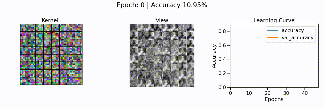
What we can see here is the learning of a convolutional neural network model, in action. On the left, we can see the different convolutions (also called kernels), the neural network is learning. These are the particular features the network tries to find (e.g. horizontal lines, color shifts from red to green, circular patterns, etc.). In the middle we can see how each of these convolutions sees the puppy image from before, and on the right we can see how the overall accuracy of the model (on the training and validation set) slowly increases through the 48 epochs we trained the network for.
To verify that the model improved its prediction capability, let’s take another look at the puppy classification from before.
predict_single_image(model, x_test, y_te, labels, idx=16)
Much better! Actually, when we compute the overall accuracy this model would reach on a never before seen test set of 10’000 images, it reaches an average prediction accuracy of 65.89%.
loss, acc = model.evaluate(x_test, y_te)
print("Accuracy on test set: %f" % acc)
313/313 [==========] - 3s 11ms/step - loss: 1.1656 - accuracy: 0.6589
Accuracy on test set: 0.658900
Last but not least, and for fun, let’s select a few images from this test set and see how the individual prediction probabilities become more and more opinionated during training.
# Duplicate first and last figure to have a "resting phase" impression
!for i in {1..4}; do cp pred_000_0000.jpg pred_000_0000_$i.jpg; done
!for i in {1..4}; do cp pred_000_0048.jpg pred_000_0048_$i.jpg; done

# Concatenate images into a gif
!ffmpeg -y -framerate 4 -pattern_type glob -i 'pred_000_*.jpg' cnn_predictions.gif

# Removes temporary files
!rm conv_0*.jpg pred_0*.jpg temp.jpg

# Show gif
from IPython.display import Image
Image(url="cnn_predictions.gif")